Anand's Google Nexus One Review
by Anand Lal Shimpi on April 3, 2010 3:40 AM EST- Posted in
- Smartphones
- Mobile
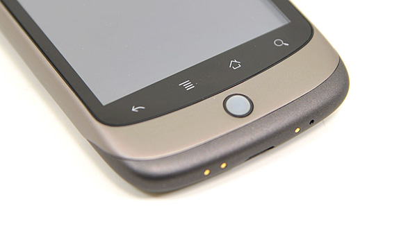
The Home Bar
The Nexus One has three physical buttons: a power/lock button at the top, volume rocker on the left side and a trackball/button on the face.
The trackball is mostly useless. The Nexus One has a 3.7” multitouch screen for a reason, and it’s way quicker to use the screen than to use the trackpad for scrolling. There are some limited situations where the trackball can be useful, for example while playing games. The iPhone has no useful physical buttons for gaming, the Nexus One’s trackball is better for moving a character around than a virtual d-pad.
Above the trackball there are four touch buttons with fixed functions: back, menu, home and search. By default all provide haptic feedback when activated. In other words, they vibrate a bit when you touch them. It’s a fine feature but it’s nowhere near the feedback you get from physical buttons if that sort of thing matters to you. The buttons also give you the same feedback regardless of whether or not their operation is permitted in the current mode (e.g. hitting the contextual menu button when no such menu exists).
The back button is useful and works as intended, it goes back a screen. The menu button takes some getting used to. The best way I can describe it is like a right click. You get a contextual menu depending on what app you’re running. At the home screen it lets you pop into Android’s settings, add application shortcuts, change wallpaper, view notifications and search. In the email app the contextual menu lets you refresh your inbox, switch to a different folder, change settings, etc...
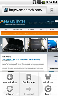
The contextual menu in Android's Browser app
This is where Android’s more PC-side comes out to play. Apple and Palm for the most part try to keep these sorts of menus away from you. Apps are purposefully not very deep and settings are all controlled through the settings screen, not from within an app. Functionality is driven by the UI. Android takes a more application centric approach. Neither is right or wrong, but both approaches have their pros and cons. I’d argue that Apple/Palm’s approach is better suited for something that’s going to be used as a passive device. Something you’re quickly scanning emails or text messages on. Google’s take is more PC-like. Give the users the options they want, where they want them, even at the risk of UI simplicity.
The Apple method runs the risk of limiting functionality, while Google’s risks turning the UI into a cumbersome mess. Neither is there today, but left unchecked that’s where they’d end up.
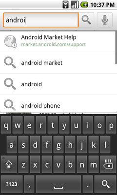
Moving on, the home button works as expected, it takes you to your home screen. The search button is particularly interesting because it is one Android feature that Microsoft copied in Windows Phone 7. Hitting the search button brings up an autocomplete enabled Google search box. Hitting go, launches the web browser (very quickly thanks to Mr. Snapdragon) and displays your search results.
What MS is proposing for WP7 are contextual search results that are formatted for the smartphone. Akin to a search app if you will. Search for GeForce GTX 480 and get a normal listing of websites. Search for dentists and get a smartphone formatted list of dentists in your area. Granted MS’ proposal is just that, a proposal, while Android is shipping today. Enabling similar functionality though shouldn’t be hard for Google. I’d love to be able to search, pull results from the web, but have the results presented as more of an app.
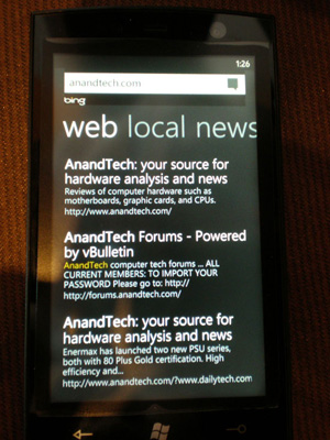
Windows Phone 7 Search
The search function will autocomplete things like address book entries, but it won’t automatically search your email for you. While the iPhone’s search function is more focused on searching your device, Android is more interested in helping you search the web. Google has a search engine, Apple doesn’t, the distinction makes sense.


95 Comments
View All Comments
fepple - Wednesday, April 7, 2010 - link
+1 for mention of cyanogenAlso of note there is no equaliser which I think the iPhone has?
doratiog - Saturday, April 3, 2010 - link
The possibility of reading the whole article without the tiring exercise of clicking and clicking again like if readers would have been punished and obliged to suffer Tantalus torture is gone. Not a good and rational decision if you wanted to improve your site.Voo - Saturday, April 3, 2010 - link
It's just a beta and will come back in no time, so no worries.Other than that.. tiring exercise of clicking a dozen times on a button? Well you could say that, but imho that's a bit far stretched isn't it? ;)
adityanag - Saturday, April 3, 2010 - link
Print.. PLEASE bring back print!!Anand Lal Shimpi - Saturday, April 3, 2010 - link
My apologies for not getting it up sooner, we've been swamped with fixes and behind the scenes updates most of this week. We should see it very soon though, just a little while longer :)Take care,
Anand
microAmp - Saturday, April 3, 2010 - link
If you're using Firefox, try the add-on AutoPager, it'll load the next page while you're scrolling and reading the current page.runner50783 - Sunday, April 4, 2010 - link
I do appreciate the layout, It's a much more organized and concise experience than blogs..., Anantech is not a blog and I hope it does not become one.Trisagion - Saturday, April 3, 2010 - link
Nice review.I wish you would review the Blackberry Storm2 as well. As a long term Blackberry user, maybe you can give us your thoughts on how productive the phone is without the trademark keyboard. It will also round up the current generation of smart phones - iPhone, Pre, Android and Storm.
straubs - Saturday, April 3, 2010 - link
I think the reason that isn't done is the first Storm was such a flop that really no one considers the Storm to be a competitor with iPhone, Android, or Pre.Trisagion - Sunday, April 4, 2010 - link
That is true, but it's the only touch phone in the Blackberry ecosystem, so I wanted Anand's take on it but anyway...