The iPhone 6 Review
by Joshua Ho, Brandon Chester, Chris Heinonen & Ryan Smith on September 30, 2014 8:01 AM EST- Posted in
- Smartphones
- Apple
- Mobile
- iPhone 6
With every launch of the iPhone, Apple seems to have everything to lose and not much to gain. Apple’s iPhone line accounts for the majority of profits in the smartphone space, and as the smartphone market marches towards maturity it seems inevitable that companies like Xiaomi will be able to deliver largely similar experiences at much lower prices. The same once happened with Apple in the days of the PC industry where Apple approached irrelevance. Yet generation after generation, Apple seems to be able to hold on to a majority of profit share, and they’ve managed to tenaciously hold on to their first-mover advantage.
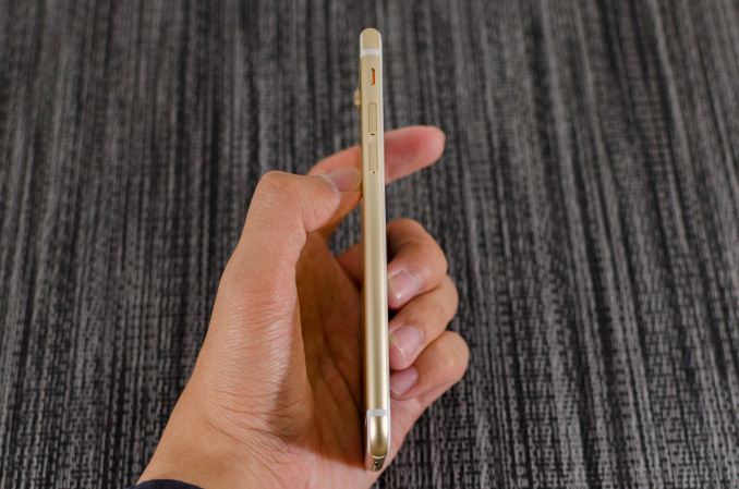
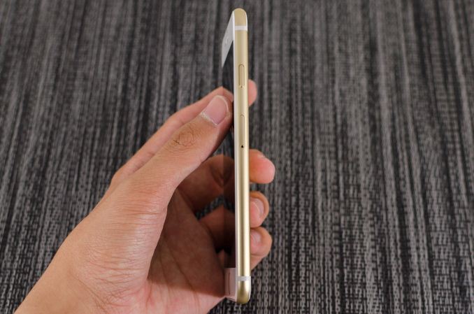
This brings us to the iPhone 6. This is now the eighth generation of the iPhone, and the fifth generation of the iPhone’s industrial and material design. We should note right now that this review is specifically for the iPhone 6; for the iPhone 6 Plus, please see our iPhone 6 Plus companion review. At this point, it’s not really possible to revolutionize the smartphone, and on the surface, the iPhone 6 seems to be directly inspired by the iPod Touch. However, instead of the chamfered edge where the display meets the metal unibody we see a continuous curve from the sloping glass to the metal unibody that looks and feels great. While the M8 was one of the best phones for in-hand feel, the iPhone 6 goes a step further due to the reduced weight and rounded side. I've always felt like the HTC 8X had one of the most compelling shapes for a phone, and the incredibly thin feel of the iPhone 6 definitely reminds me of that.
Along the left side, we see the standard volume buttons and mute switch that continue to have the same solid feel and clean clicking action. As I discuss in the iPhone 6 Plus review, going by Consumer Reports' data it seems that there is a weak point near the bottom of the volume rocker, although it's far less likely to be an issue on the iPhone 6 due to its smaller size. Along the top, there isn’t a power button because it’s been moved to the right side of the phone so there’s nothing notable on the top.
On the right side, we see the previously mentioned power button and also the SIM tray, which is ejected by inserting a pin into the eject hole. Similarly to the volume buttons, the power button has a solid feel that gives a distinct click when triggered and continues to be quite unique when compared to phones other than recent iPhones.
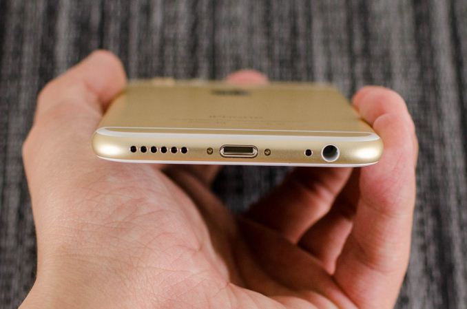
The bottom has the Lightning connector, speaker, a microphone, and 3.5mm headset jack. The placement and design of all these elements are largely similar if not shared directly with the iPod Touch.
The back of the phone continues to share elements from the iPod Touch. The camera, microphone, and LED flash are almost identical in their appearance, even down to the camera hump’s design. The LED flash does look different to accommodate the second amber flash, but the shape is identical. The only real difference is that the antennas of the iPhone 6 are the metal pieces on the top and bottom, with the associated plastic lines instead of a plastic RF window.
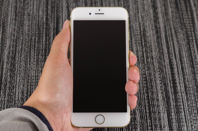
The front of the phone is decidedly more similar to the iPhone 5s though, with the Touch ID home button. While the earpiece hasn’t moved, it seems that the front facing camera has been moved back to the left side of the earpiece, and the sensors for light and proximity are now above the earpiece. For the most part, there’s not much to comment on here but after using the iPhone 6 for an extended amount of time I’m definitely sure that the home button is relatively closer to the surface of the display glass than before. In addition, the home button has a dramatically improved feel, with short travel, clean actuation, and a reassuring click in most cases.
Overall, while I was undecided at the launch of the iPhone 6 I definitely think the look of the new iPhone has grown on me. The camera hump’s accent serves as an interesting design touch, and the feel of the design is definitely much more comfortable and ergonomic than before. I’m not really sure that the extra reduction in thickness was necessary, but it does make for a better first impression. In the launch article I was a bit surprised that Apple chose to have a camera hump but given the fact that the iPod Touch has the same design it seems that there is precedent for such a move. I personally feel that the design wouldn’t be worse by increasing thickness to eliminate the hump and improve battery life as a result.
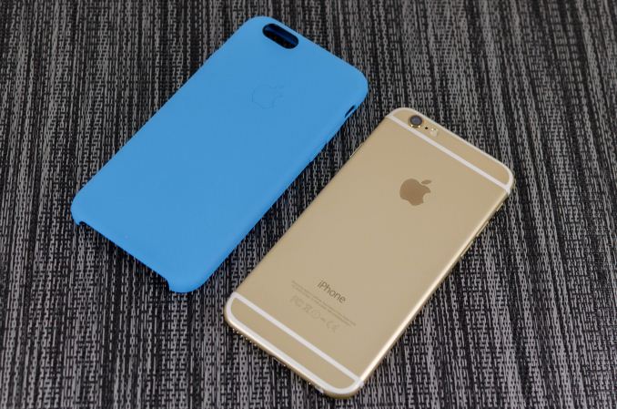
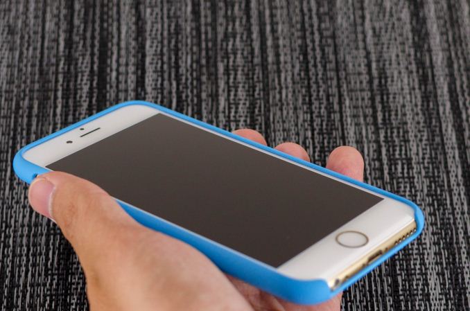
Apple has also introduced a new silicone case, which brings a lower price point than the leather cases. Surprisingly, this is a rather high quality case, and as far as I can tell it doesn’t carry any of the issues that silicone cases traditionally have. There’s a nice lip to make sure that the display glass doesn’t touch a surface if the phone is put face down, and the material doesn’t seem to stretch or attract pocket lint the way most silicone cases do.
There’s definitely a lot more to talk about though, and to get a sense of the major differences I’ve put together our usual spec table below.
| Apple iPhone 5s | Apple iPhone 6 | Apple iPhone 6 Plus | |
| SoC | Apple A7 | Apple A8 | Apple A8 |
| Display | 4-inch 1136 x 640 LCD | 4.7-inch 1334 x 750 LCD | 5.5-inch 1920 x 1080 LCD |
| WiFi | 2.4/5GHz 802.11a/b/g/n, BT 4.0 | 2.4/5GHz 802.11a/b/g/n/ac, single stream, BT 4.0, NFC | |
| Storage | 16GB/32GB/64GB | 16GB/64GB/128GB | 16GB/64GB/128GB |
| I/O | Lightning connector, 3.5mm headset | ||
| Size / Mass | 123.8 x 58.6 x 7.6 mm, 112 grams | 138.1 x 67 x 6.9 mm, 129 grams | 158.1 x 77.8 x 7.1 mm, 172 grams |
| Camera |
8MP iSight with 1.5µm pixels Rear Facing + True Tone Flash 1.2MP f/2.4 Front Facing |
8MP iSight with 1.5µm pixels Rear Facing + True Tone Flash 1.2MP f/2.2 Front Facing |
8MP iSight with 1.5µm pixels Rear Facing + True Tone Flash + OIS 1.2MP f/2.2 Front Facing |
| Price | $99 (16GB), $149 (32GB) on 2 year contract | $199 (16GB), $299 (64GB), $399 (128GB) on 2 year contract | $299 (16GB), $399 (64GB), $499 (128GB) on 2 year contract |
As you can see, this is a major release even at a high level. While the design might take some inspiration from the iPod Touch, the hardware is a completely different beast. There’s a new SoC, the A8; the iPhone 6 also includes a bigger and better display, newer WiFi module, bigger battery, and a better camera. Of course, there’s a lot more to the story of the iPhone 6 than a spec sheet. The first major difference that we’ll talk about is the SoC.




531 Comments
View All Comments
Samus - Tuesday, September 30, 2014 - link
Too many people define "good LCD" as having high resolution. In the real world, that just isn't true. There are so many terrible 1920x1080 panels on the market, and I'm not just talking mobile devices.Look at desktop LCD's. To get one properly calibrated you need to spend $500+ for a 24" HP Dreamcolor or NEC Multisync PA Spectraview. Some Dell's with Samsung LCD's are pretty good out of the box but almost nothing is 100% RGB until expensive calibration.
So back to Apple. They're all about balance. They don't push the envelope in any direction like Samsung (and others.) What bothers me lately about Apple is they are "too" safe with their design language and technology that their products are actually becoming boring. As the company that pioneered mainstream unibody mobile devices and multitouch\gesture driven interfaces, it's interesting the competition has essentially been perfecting it for them to just copy back.
At least Apple isn't suing everybody anymore...seems like Steve's thermonuclear crusade is finally dying along with him.
Omega215D - Tuesday, September 30, 2014 - link
I do have a problem with people constantly trying to push AMOLED as the ultimate display tech due it being featured on DisplayMate with the Galaxy S5. People forget that you lose the efficiency of OLED once you start using something that displays a lot of white like web browsing. Also, turning down the brightness still has the tendency to give it a "soggy" look to it, though it is much less on the Galaxy S5.The burn in effect can be easily avoided unless the clock/ dock locks up for whatever reason and leaves the display static.
darkich - Tuesday, September 30, 2014 - link
The burn in can be easily prevented also.Download an utterly simple burn in tool app, and leave it working for couple of hours, every few weeks or so.
nevertell - Wednesday, October 1, 2014 - link
This is exactly the kind of thing that people DO NOT WANT TO DO.It's a phone, it must just work, I shouldn't worry about any specific technical part of the phone, let alone do maintenance work on it to keep it functional.
elajt_1 - Friday, October 3, 2014 - link
Nah, thats for bad image retention. If you already got a burn-in you can't do anything about that as of now.Toss3 - Wednesday, October 8, 2014 - link
In my experience AMOLED displays look a lot better than their LCD counterparts with the brightness turned down. They also give you the option of having even lower screen brightness which is ideal if you want to use it in bed at night (night mode on android looks great on the S4, but not so much on my Nexus 5).hoelee - Thursday, December 4, 2014 - link
IPhone white balance not accurate, how you proven your point said iPhone had good display? At least I saw on mine eye compare between mine z3 with the so call iPhone... Besides, you calculate by yourself, iPhone 6 latest phone less 1x pixels to push compare to android FHD screen. Benchmark alway unfair in mine point of view...braveit - Friday, December 12, 2014 - link
Apple hasn't really done much on it's new iPhone 6 release. Source: http://berichinfo.com/reasons-iphone-6-sucks/Caliko - Tuesday, October 6, 2015 - link
Who else is innovating in design?All phones today are iKnockoffs.
Steve's thermonuclear attack has juat started buddy!! Droid is making manufacture lose billions. Can't wait to see who goes bankrupt first!!
akdj - Thursday, October 2, 2014 - link
The 'little SD expansion slot' that reads and writes at about 6-8Mb/second vs, the onboard NAND speed tested within the review should be enough to tell you why samsung and ....hmmm ....are offering the micro SD slot. Android is moving 'away' from accessibility to and from the 'off board' storage. I've got a Note 3 and with each update I've been able to do less and lessApparently you didn't bother to read the review ...at all. You also mention 'good LCD ...at least as good as the competitors.'
Then you quite DisplayMate. The S5. And the single point difference between it and it's LCD runner up. From Apple. If you'd have bothered to have read this review ...or the S5 review on Anand's site when it dropped you'd know A) how impressed the author was with the evolution of AMOLED, it's continued refinement and accuracy, brightness and viewing angles. B) you'd notice in EVERY possible measurement. Each one in the review are 'objective measurements'. It (6) tops the display's characteristics in each area someone that knows what a 'great display' entails. At 400+ PPI, you nor any of your freneds will distinguish the difference between it and the new Note 4 or any other 2540 display. It's silly, it's a waste of energy and its detrimental to fluency of the UI (with today's SoC GPU and that many pixels) and the ever important 'battery life'
To be fair, NO OTHER vendor offers 128GB, & 64 is extremely rare. I waited six weeks for a Note 3 w/64GB to show up at AT&T. Never happened and I settled for 32. At the same price as the 64GB iPhone 6.
And from what I've read the 2014 model will have the same. 32GB with a caveat. Buy a micro SD card. Hope Google allows support in the future and keep your fingers crossed. 1080p on my Note chews up space. 4K is quadruple. And it will NOT shoot to the fastest SD or microSD card on the market.
As an ambidextrous owner and user since their inception, I enjoy both Android and iOS. But silly comments like yours shows your ignorance. It was IN THE review! The actual (& damn near identical testing method used by DisplayMate's team will use) 'proof' it's 'LCD ....(IS) @ least as good as its competitors.