The iPhone 6 Review
by Joshua Ho, Brandon Chester, Chris Heinonen & Ryan Smith on September 30, 2014 8:01 AM EST- Posted in
- Smartphones
- Apple
- Mobile
- iPhone 6
With every launch of the iPhone, Apple seems to have everything to lose and not much to gain. Apple’s iPhone line accounts for the majority of profits in the smartphone space, and as the smartphone market marches towards maturity it seems inevitable that companies like Xiaomi will be able to deliver largely similar experiences at much lower prices. The same once happened with Apple in the days of the PC industry where Apple approached irrelevance. Yet generation after generation, Apple seems to be able to hold on to a majority of profit share, and they’ve managed to tenaciously hold on to their first-mover advantage.
This brings us to the iPhone 6. This is now the eighth generation of the iPhone, and the fifth generation of the iPhone’s industrial and material design. We should note right now that this review is specifically for the iPhone 6; for the iPhone 6 Plus, please see our iPhone 6 Plus companion review. At this point, it’s not really possible to revolutionize the smartphone, and on the surface, the iPhone 6 seems to be directly inspired by the iPod Touch. However, instead of the chamfered edge where the display meets the metal unibody we see a continuous curve from the sloping glass to the metal unibody that looks and feels great. While the M8 was one of the best phones for in-hand feel, the iPhone 6 goes a step further due to the reduced weight and rounded side. I've always felt like the HTC 8X had one of the most compelling shapes for a phone, and the incredibly thin feel of the iPhone 6 definitely reminds me of that.
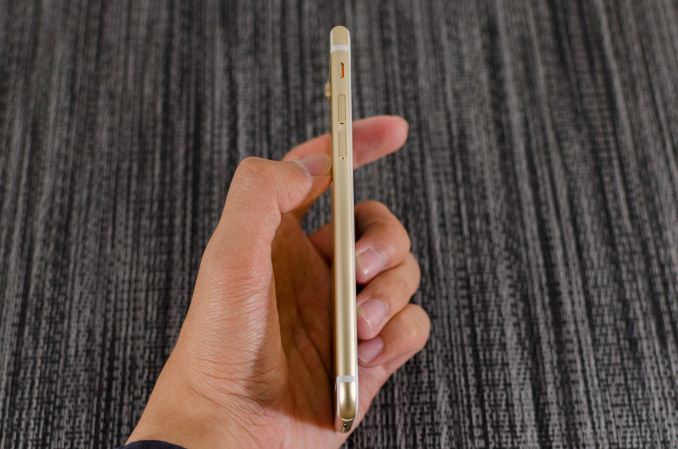
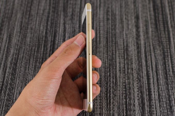
Along the left side, we see the standard volume buttons and mute switch that continue to have the same solid feel and clean clicking action. As I discuss in the iPhone 6 Plus review, going by Consumer Reports' data it seems that there is a weak point near the bottom of the volume rocker, although it's far less likely to be an issue on the iPhone 6 due to its smaller size. Along the top, there isn’t a power button because it’s been moved to the right side of the phone so there’s nothing notable on the top.
On the right side, we see the previously mentioned power button and also the SIM tray, which is ejected by inserting a pin into the eject hole. Similarly to the volume buttons, the power button has a solid feel that gives a distinct click when triggered and continues to be quite unique when compared to phones other than recent iPhones.
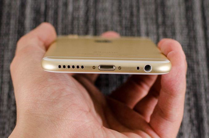
The bottom has the Lightning connector, speaker, a microphone, and 3.5mm headset jack. The placement and design of all these elements are largely similar if not shared directly with the iPod Touch.
The back of the phone continues to share elements from the iPod Touch. The camera, microphone, and LED flash are almost identical in their appearance, even down to the camera hump’s design. The LED flash does look different to accommodate the second amber flash, but the shape is identical. The only real difference is that the antennas of the iPhone 6 are the metal pieces on the top and bottom, with the associated plastic lines instead of a plastic RF window.
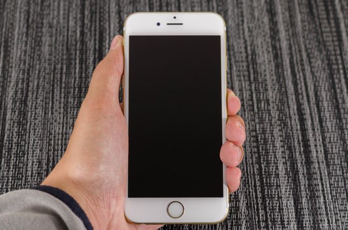
The front of the phone is decidedly more similar to the iPhone 5s though, with the Touch ID home button. While the earpiece hasn’t moved, it seems that the front facing camera has been moved back to the left side of the earpiece, and the sensors for light and proximity are now above the earpiece. For the most part, there’s not much to comment on here but after using the iPhone 6 for an extended amount of time I’m definitely sure that the home button is relatively closer to the surface of the display glass than before. In addition, the home button has a dramatically improved feel, with short travel, clean actuation, and a reassuring click in most cases.
Overall, while I was undecided at the launch of the iPhone 6 I definitely think the look of the new iPhone has grown on me. The camera hump’s accent serves as an interesting design touch, and the feel of the design is definitely much more comfortable and ergonomic than before. I’m not really sure that the extra reduction in thickness was necessary, but it does make for a better first impression. In the launch article I was a bit surprised that Apple chose to have a camera hump but given the fact that the iPod Touch has the same design it seems that there is precedent for such a move. I personally feel that the design wouldn’t be worse by increasing thickness to eliminate the hump and improve battery life as a result.
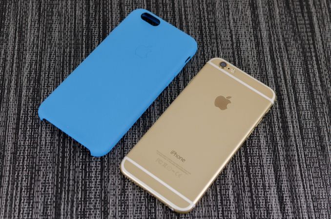
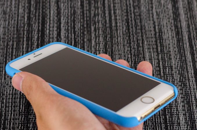
Apple has also introduced a new silicone case, which brings a lower price point than the leather cases. Surprisingly, this is a rather high quality case, and as far as I can tell it doesn’t carry any of the issues that silicone cases traditionally have. There’s a nice lip to make sure that the display glass doesn’t touch a surface if the phone is put face down, and the material doesn’t seem to stretch or attract pocket lint the way most silicone cases do.
There’s definitely a lot more to talk about though, and to get a sense of the major differences I’ve put together our usual spec table below.
| Apple iPhone 5s | Apple iPhone 6 | Apple iPhone 6 Plus | |
| SoC | Apple A7 | Apple A8 | Apple A8 |
| Display | 4-inch 1136 x 640 LCD | 4.7-inch 1334 x 750 LCD | 5.5-inch 1920 x 1080 LCD |
| WiFi | 2.4/5GHz 802.11a/b/g/n, BT 4.0 | 2.4/5GHz 802.11a/b/g/n/ac, single stream, BT 4.0, NFC | |
| Storage | 16GB/32GB/64GB | 16GB/64GB/128GB | 16GB/64GB/128GB |
| I/O | Lightning connector, 3.5mm headset | ||
| Size / Mass | 123.8 x 58.6 x 7.6 mm, 112 grams | 138.1 x 67 x 6.9 mm, 129 grams | 158.1 x 77.8 x 7.1 mm, 172 grams |
| Camera |
8MP iSight with 1.5µm pixels Rear Facing + True Tone Flash 1.2MP f/2.4 Front Facing |
8MP iSight with 1.5µm pixels Rear Facing + True Tone Flash 1.2MP f/2.2 Front Facing |
8MP iSight with 1.5µm pixels Rear Facing + True Tone Flash + OIS 1.2MP f/2.2 Front Facing |
| Price | $99 (16GB), $149 (32GB) on 2 year contract | $199 (16GB), $299 (64GB), $399 (128GB) on 2 year contract | $299 (16GB), $399 (64GB), $499 (128GB) on 2 year contract |
As you can see, this is a major release even at a high level. While the design might take some inspiration from the iPod Touch, the hardware is a completely different beast. There’s a new SoC, the A8; the iPhone 6 also includes a bigger and better display, newer WiFi module, bigger battery, and a better camera. Of course, there’s a lot more to the story of the iPhone 6 than a spec sheet. The first major difference that we’ll talk about is the SoC.




531 Comments
View All Comments
elajt_1 - Friday, October 3, 2014 - link
(@melgross) And to call you one would be an insult to an idiot.Apart from the rage, I think it was he made some valid points.
Jimrod - Tuesday, September 30, 2014 - link
You mad bro?rational_wannabe - Tuesday, September 30, 2014 - link
You have serious issues. So it's OK for Samsung to sell their plastic crap for the same amount of money? Nice way of rationalizing things...danbob999 - Tuesday, September 30, 2014 - link
Yeah it's OK since there is nothing wrong with plastic. It absorbs shock, is light and do not block wireless signal. Perfect material for a phone. It is also durable enough. How many people replace their phone because the plastic is cracked? Not much. People replace their phone either because the screen is broken, it was damaged by liquid or simply because it is too slow/old.Apple has been selling phones which are cheaper to produce for years at the same price (or higher) than the competition. Smaller phones tend to be cheaper, because the display is cheaper, the battery is cheaper, and the rest cost the same. So even by using plastic, Samsung phones cost more to produce so I fail to see how they can be labeled as "cheap".
blackcrayon - Tuesday, September 30, 2014 - link
Apple is spending far more in developing the phone in other areas though. Writing the OS, designing custom SoCs, etc.danbob999 - Tuesday, September 30, 2014 - link
Designing custom SoCs is an investment. It isn't supposed to raise the cost of the phone.Samsung also design some of its own SoCs and even manufacture them.
The OS is debatable. But from a hardware perspective Samsung phones (at least the high end ones) are definitely not cheap, even if they use plastic.
Parhel - Tuesday, September 30, 2014 - link
R&D should affect the cost of the product? That's not how it works . . .Parhel - Tuesday, September 30, 2014 - link
Ugh.. meant to say R&D "shouldn't". To state it plainly, R&D may be an investment, but it's still an expense. The cost needs to be recouped, and they make money by selling phones, so . . . you do the math.danbob999 - Tuesday, September 30, 2014 - link
Of course they have to make money. But spending more in software development, R&D or marketing doesn't make their phone any less "cheap". I was replying to someone saying that Samsung phones were "cheap" because they were in plastic. The fact is that Samsung phones tend to be more expensive than iPhones to make, because the cost of the components is higher, despite any savings made by using a plastic shell.akdj - Friday, October 3, 2014 - link
Only BECAUSE it takes my Note3 twice the cores, at twice the clock speed with three times the amount RAM to FINALLY close the gap on performance. Almost. My 5s is still quicker playing Asphalt8, manipulating photos, even rendering VIDEO! Most likely the latter because of the extreme lack of interet in the development community (other than game ports) to 'build out' apps and software. And that sucks! I love my Note 3--- coming from the original its a massive upgrade. That said, Samsung is using stock, off the shelf SoCs ....indeed 'produced' by them as they've got the capabilities to cook bake and roll out silicon BUT they've chosen to increase horsepower, drop the gearing ratios and add a stage III nirrous kit 'built' and low level programmed with basic ARM instructions and a radical slather of Peanut Butter JavaScript to wade through just for TouchWiz. By the time you open an app, you're at 85-90% RAM usage. I've got a N3. I like it and I'm not getting rid of it. It serves it's purpose for our business perfectly. But AS a business owner and one that relies on creative talent to make it 'work' I find your comment very VERY ill informed and 'ignorant' ...no to be a dick. But yes, R&D is definitely a percentage figured into the equation with BOM. As well, the software development, A8 & the second generation 64bit processor with a faster GPU, more efficient memory managment with the SoC 4mb buffer and iOS 8 itself are expenses. Paid to a LOT of talent! For crying out loud, they developed a new CODE! And a spectacular one at that! Free lessons are everywhere and if you're experienced, have a macbook laying around, download the latest XCode and you'll have Swift down in a weekend. Not to mentioned the low level 'Metal' instruction set to eliminate the OpGL ES overhead ...allowing developers 'direct' (hence, 'Metal') access to the GPU ...if you're at all curious on how incredible this development most consumers will NEVER know about ...check out Unreal 4's site, the UR4 engine and what they've done with Metal. You can download their patio presentation frim WWDC in the app store. It's absolutley amazing. Samsung's phones are spendy because they're licensing Wacom, using active digitizers few are able use (until this evolution, three's a charm I guess), massive batteries, a horrid looking bezel that's rigid for sure, but then again, this is the first I've seen people, on purposes bending phones, and that's not a real life issue or even concern. I shared earlier, somehow my nine year old son has managed to keep his iPod touch fifth gen in perfect non bent and scratch free condition. Two years. Lotsa boogers and bumps but no dents, no dings, scratches or 'display marks' without screen protection. Guesses can be made in physical pieces. Even how long (labor pricing) to produce a single unit. But development of actual silicon, low level optimization to your non fragmented operating system, 64bit technology 24 months ahead of the industry and obvious benefits from the 20nm A8. iOS 8 (and its counterpart more than ever, OS X 10.10) and its ability to aggregate our information across devices, handoff calls, emails, texts or whatever the hell you're doing on your iPad ....get distracted, fall out and when you turn your iMac or MBP on, there's the email you were working on. Ready for you to finish. The web page you were reading or the movie your were watching ...vice versa too. Start on your computer a doc, and open your iPhone, there'll be a small 'doc' icon signifying you're working on something and you're able to finish it here! Forget the phone downstairs, your in bed reading before sleep, phone rings...no worries. Answer it on your iPad. AirDrop between laptop, tablet and phone, MacPro and ipad....iPhone to your iMac, slick n quick.Of course, then there's the whole 'build quality' argument. Where designers, reviewers, and the public ALL Seem to agree. The iPhone SNOKES Samsung's BQ. Period. They're like jewelry, true and real 'art'. Each phone has been an engineering marvel. Samsung? Are you kidding me? Other than their goofy, curvy, earthy S3 baby blue tangent, their 'rectangle' phone lacks ANY design fundamentals much less achievements.
When you sell as MANY pieces as Apple does, costs come down. For the 'pieces'. But the machining process (2 year cycle) is entirely changed. Fusion welding and sapphire 'plants', robotics and laser/chamfered edging with incredible attention to detail are just a couple of the hundreds of THOUSANDS of re-tooling the facilities for the latest 'build'. And after a couple of hours today with the 6 & 6+ as we anxiously await ours, with an open mind (& as an ambidextrous user of Android and iOS Windows and OS X) --- NOTHING on the Internet does justice to the phone itself. It's. Absolutely. AMAZING!