HTC One max Review - It's Huge
by Brian Klug on October 28, 2013 10:00 AM EST- Posted in
- Smartphones
- HTC
- Mobile
- One
- Snapdragon 600
- Android 4.3
- One max
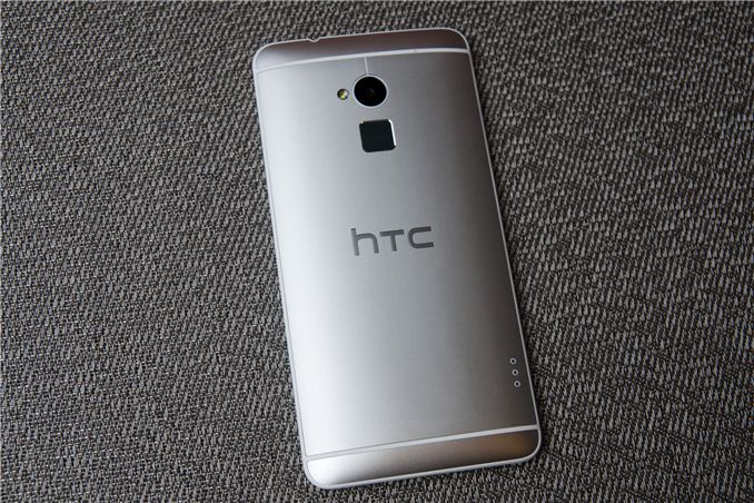
Big phones are all the rage right now. Although tablets promised the kind of extra screen real estate that would increase productivity while still retaining portability, there’s ultimately nothing more likely to be on your person than a phone. I wager that at least some of the success of the supersized smartphone form factor is still that a phone is ultimately always on your person, while a tablet still isn’t.
Today we’re looking at HTC’s newest member of its flagship One series, and its largest, the aptly named One max. Although HTC has been no stranger to larger display form factors (remember how big the HD2 seemed back in 2009?), the One max is to my knowledge the largest smartphone HTC has ever made, eclipsed only by the short lived HTC Flyer and Jetstream tablets. In the HTC phone portfolio, it’s easily the largest smartphone they’ve ever made, and that’s noteworthy.
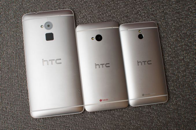
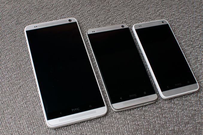
The strategy for HTC’s One lineup seems to have been a simple one, differentiated by display size and form factor. We saw the flagship, dare I say midsized HTC One come first, then the smaller, lower end HTC One mini, and finally the huge HTC One max.
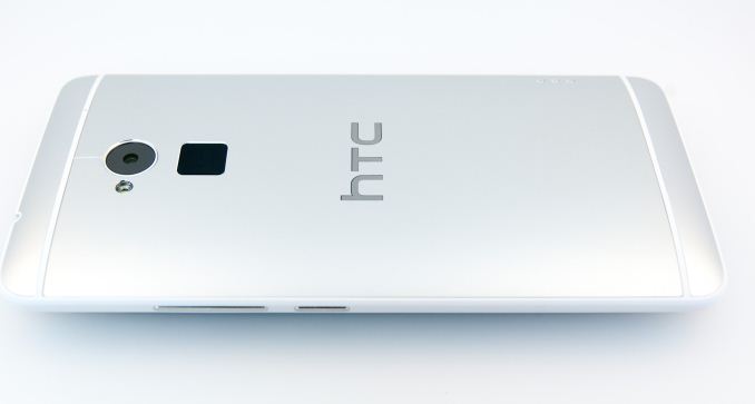
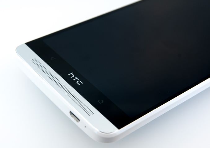
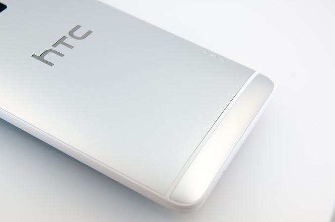
At a high level this strategy is pretty basic - offer three form factor options that yield almost the same experience. All three are predominately metal and share roughly the same industrial design notes, featuring an aluminum backside with top and bottom notches for antennas, center mounted camera, and LED flash. On the front, big stereo speaker grilles at the top and bottom, and the same button arrangement, just back and home.
I never had a problem locating the power button on the One, but then again I apparently have longer fingers than most. The power button moves down below the volume rocker on the One max, which does make sense since using your thumb to actuate power naturally positions your index finger right next to the fingerprint scanner.
I have no complaints about the buttons on the One max, they seem different somehow but still are communicative and don’t rattle around.
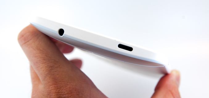
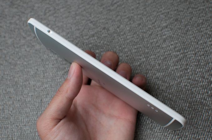
Up top there’s the headphone jack and IR port, which is slightly recessed. It isn’t the power button this time, just an IR window.
| HTC One mini | HTC One | HTC One max | |
| Height | 132 mm | 137 mm | 164.5 mm |
| Width | 63.2 mm | 68 mm | 82.5 mm |
| Thickness | 9.25 mm | 9.3 mm | 10.29 mm |
| Mass | 122 grams | 143 grams | 217 grams |
| Display Size | 4.3-inch | 4.7-inch | 5.9-inch |
| Display Resolution | 1280 x 720 | 1920 x 1080 | 1920 x 1080 |
| SoC |
1.4 GHz Snapdragon 400 (4x Krait 200) |
1.7 GHz Snapdragon 600 (4x Krait 300) |
1.7 GHz Snapdragon 600 (4x Krait 300) |
| Camera | 4 MP F/2.0 Ultrapixel with LED | 4 MP F/2.0 Ultrapixel with OIS and LED | 4 MP F/2.0 Ultrapixel with LED |
| Battery | 1800 mAh, 3.8V, 6.84 Whr | 2300 mAh, 3.8V, 8.74 Whr | 3300 mAh, 3.8V, 12.54 Whr |
| WiFi | 802.11a/b/g/n | 802.11a/b/g/n/ac | 802.11a/b/g/n/ac |
| Storage | 16 GB NAND | 32 GB NAND | 32 GB NAND + microSD |
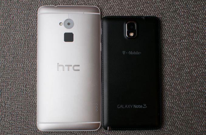
If the dynamic range in size between the One mini and One is a 2 on an arbitrary scale of 1–10, the dynamic range between the One and One max is at least a 9. While the One mini really isn’t that much smaller than the normal One, the One max lives up to its namesake in a dramatic fashion. It’s positively huge, it literally is the One design taken to the max. The One max makes the Note 3 feel almost normal by comparison, and the entire normal sized 5-inch smartphone demographic feel downright small.
The One max is definitely a two-hand device, one handing it is difficult if not impossible, although I doubt that was anyone’s goal for this thing. It’s big in 2D dimensions, and it’s also somewhat heavy, at 217 grams, but I guess that’s expected given the material choices.
What’s interesting about the One max is that the truth is that its design is a lot more like a vastly larger One mini than it is the original One. We saw the mini come after the One and bring a plastic lip rather than the gorgeous diamond-machined edge that the One had, partly for cost reasons, partly for survivability when dropped on a hard surface. Truth be told, I can understand the rationale for having a plastic ring around the device and it making drops and blemishes a bit less destructive. I filed my HTC One down after a drop to my tile floor dented the chamfered edge a bit. The tradeoff however is that you’re now touching more plastic than metal.
I was initially turned off by the glossy plastic ring around the One mini, but if that was what had to take a hit to make the One mini the right price point for HTC to sell into operators and still make money, I was willing to deal with it. I’ll leave discussion of the faux-metal plastic speaker grille on the One mini for another day, which thankfully the One max doesn’t have.
Anyhow the One max inherits the same plastic ring around the edge design that the One mini debuted with. The polymer has been changed slightly, it’s a more matte, grittier finish that makes it a bit grippier and less chintzy feeling than the One mini’s slippery, glossy finish. The One max also includes aluminum speaker grilles, not the faux-metal plastic cutouts that adorn the One mini.
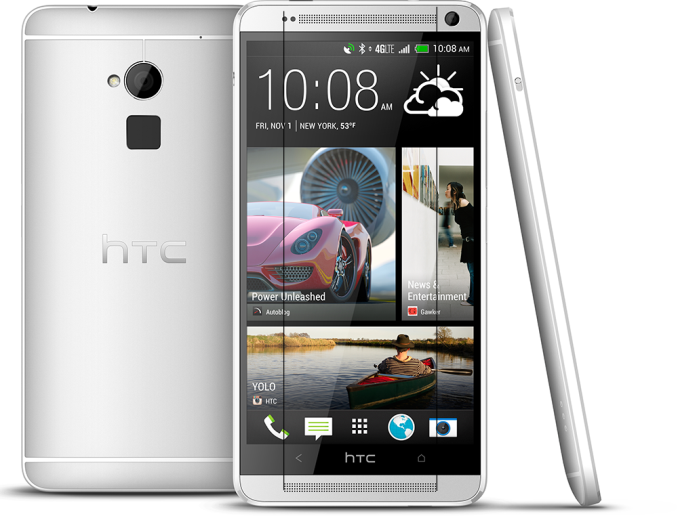
Now you also won't be able to unsee it (lines added to show asymmetry)
Let’s talk about the speaker grilles for a moment. What I loved about the original One design was how balanced everything felt. The polymer strips required for the antenna array carried over to the front and felt logical, it seemed like each cut had a purpose. On the One max however, I can’t get over how the speaker grille dots aren’t lined up and symmetrical at top. Something bugged me about the One max’s appearance for a few days until I noticed exactly what didn’t seem balanced anymore, so there’s that. I hesitate to make a big deal about it, but it might be a microcosm of what’s really weird about the One max.
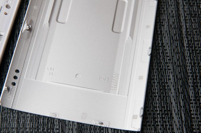
The One max also takes a nod from a few of the Asian variants of HTC One which featured a removable back to accommodate two SIMs (when necessary) and a microSD card slot. The One max makes the removable back and microSD card slot standard, in addition to eschewing a SIM tray and enabling design commonality when dual SIM is necessary. What it doesn’t add is a removable battery, since HTC continues its use of a pyramid-like stack of display, battery, and PCB. Peel up the label and you’ll find out you’re looking at the top of some EMI cans and shielding rather than a battery, validating that. At the bottom of the HTC One max there’s no longer a Beats Audio silkscreen (since that partnership is over), instead just blank empty space. The nice thing about having the removable door is that the regulatory markings are on the inside, there’s no laser etched part and model text on the bottom third of the One max.
There’s a small slider on the left side of the One max which pops the removable door open, it then hinges and comes off completely.
There’s definitely a tradeoff associated with this approach though. For starters, although there isn’t much flex or play in the door after it’s attached, it requires a lot of effort to make sure the door is completely seated when re-attached. In addition there’s definitely a gap at top and bottom, which is unfortunate given HTC’s narrative about zerogap construction for the original One.
The only caveat is that the One max myself and a few others were sampled was in fact a PVT (Production Validation Test) as marked, so it’s possible the door is being slightly tweaked, but I doubt it’ll change much. I’ve said my part already on microSD cards and the fact that they’re going the way of the dodo in smartphones, I just don’t need one anymore, and definitely not at the expense of build quality. It is convenient not having to use a SIM ejector tool though, even if I carry one around all the time anyways. For the incredibly small percentage of users that clamors for an SD card every single smartphone launch, it’s at least one point which won’t be belabored so tiresomely this time.
In a lot of ways the construction of the One max is more like the One mini, and I fear that comes hand in hand with making what was an expensive design (the One) profitable, something HTC does need. It still is premium and combines metal and plastic in a pleasing way, but there clearly were tradeoffs on the road to the One max.
The One max isn’t so much a phablet as it is a huge phone. I don’t know if the supersized phone market is quite mature enough to really tell what the defining properties for a phablet are yet, but the scaled up One design makes the One max feel like a huge phone. HTC doesn’t go for an active digitizer and slide-out stylus with the One max, there’s an optional capacitive stylus that’s a standalone accessory, and the scribble application I’ll get to in a bit. I don’t think there’s anything wrong with that approach quite honestly (I wager not many Note users actually use the stylus), it’s just something to note.
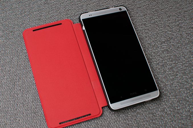
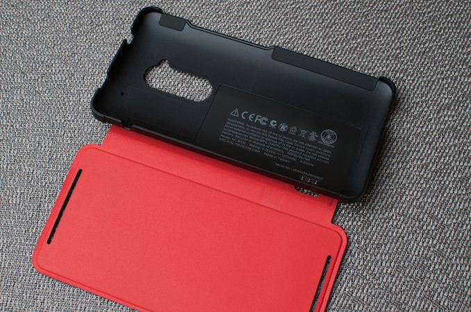
HTC Power Flip Case
HTC also sampled their new battery case, which is like the flip case we saw for the One but includes a battery in the screen cover portion. Think the Surface’s new Power Cover, but for the HTC One max. The power flip case uses three pogo pins to connect the battery directly to the One max, it’s what the pogo pads on the back of the phone are for. The case snaps on around the perimeter of the One max, and the front portion folds over the display, just like the flip case. The units we were sampled weren’t final however, and had some issues with proper fit, although fit should be rectified in the final version.
The battery isn’t huge, at 1210 mAh and 3.75V (4.53 watt-hours), but it does give a boost as I’ll show in the battery section. It also does add weight what is already an unmistakably heavy phone, and makes using the fingerprint scanner a bit more awkward.
When the power flip case is attached you get a small plus sign on the battery symbol in the status bar. I’m not sure how this actually works in practice, as the One max seems to draw from both the internal battery and the external battery at the same time, rather than using the external battery to charge the internal one. It does boost battery life however.







197 Comments
View All Comments
ddriver - Monday, October 28, 2013 - link
Doesn't seem to be doing well in its category (phablets that is) - considering devices already on the market and those soon to be launched, I'd guess the main selling point for this device will be brand loyalty. And people complained the note was too big...Omega215D - Tuesday, October 29, 2013 - link
The BoomSound speakers are much better than what the Note 3 puts out but you pay the price for them in extra height and possibly thickness. Also, HTC is pretty good at making the most of the battery capacity in which many of their phones have great standby times and good usage life.kmmatney - Tuesday, October 29, 2013 - link
The price may make a difference. I was planning on buying a note 3, but went for the LG Optimus Pro G because it was $200 cheaper at $99, and almost the same size screen. If the HTC One Max is $199, it might sway some buyers. I probably would have bought it just for the speakers.jshsimpson1 - Friday, November 15, 2013 - link
you missed out on the note 3Chaitanya - Monday, October 28, 2013 - link
a small typo on 1st page. Battery aint 1210mah, its 3300mah I believe.IanCutress - Monday, October 28, 2013 - link
1210 mAh is the Power Flip battery. 3300 mAh is the phone battery.MrCommunistGen - Monday, October 28, 2013 - link
If you're talking about this line: "The battery isn’t huge, at 1210 mAh and 3.75V (4.53 watt-hours), but it does give a boost as I’ll show in the battery section." he's referring to a battery + flip cover case.nerd1 - Monday, October 28, 2013 - link
One MAX - 164.5*82.5*10.29mm 217gGalaxy note 3 - 151.2*79.2*8.3mm 168g
I can understand the size but why that heavy and thick?
Johnmcl7 - Monday, October 28, 2013 - link
I was surprised at the thickness/weight as well, the larger Z Ultra comes in a lot thinner and a bit lighter despite the fact it has a larger 6.44in screen and fully weather sealed:Sony Z Ultra - 179.4 x 92.2 x 6.5 mm 212g
ShieTar - Monday, October 28, 2013 - link
Both the Note 3 and the Z Ultra are dead flat though, while the One Max has a nice curvature on the back. Its surely a question of personal reference which you prefer, personally I like the curved body better than something thin and flat.