Samsung Announces Galaxy Note 4: Hands On
by Joshua Ho on September 3, 2014 9:30 AM EST- Posted in
- Smartphones
- Samsung
- Galaxy
- Android
- Mobile
- Samsung Galaxy Note
By now, most people seem to have accepted the concept of a phablet. At first, I was also skeptical, as I wanted a phone that could easily be used with one hand. However, with time I've really come to appreciate the value that comes with the larger display size and S-Pen/Wacom stylus. Simply put, even though the larger size precludes the possibility of easily using the phone with one hand, the increased multitasking capabilities and improved media experience can be well worth the trade-off. While I also find unfortunate that Android OEMs seem to believe that every phone should be a phablet, it’s hard to ignore the incredible success that Samsung continues to have with the Galaxy Note phablets. It’s also increasingly difficult to nail down just what a phablet is. I still firmly believe that a smartphone should be easy to use with one hand, and a phablet requires two. However, the distinction between phablet and tablet is a matter of whether the device can be easily carried in a pocket. Of course, none of that really gives a firm, clear answer. After all, everyone is different, and differences in hand size and thumb length determine what those limits are.
At any rate, this takes us to the Galaxy Note 4. Surprisingly, Samsung has stopped their march of ever-increasing display size for the Note phablets. The Galaxy Note 4 has a 5.7” AMOLED display, with QHD/1440p resolution. This comes out to 515 PPI, which should be high enough for general smartphone usage but in my experience with the Gear VR it isn’t enough for VR usage, which holds the display as close as possible to the eye. Samsung also disclosed that they have a 2.7 GHz quad-core processor for some variants, which points squarely towards Snapdragon 805 for the US. There’s also a 1.9/1.3 GHz octa-core version, which should be an Exynos 5433 SoC. For those that have spent any amount of time following Samsung Systems LSI’s SoC nomenclature, it should be patently obvious that there are four Cortex A15s on the big cluster and four Cortex A7s on the little cluster. I’ve included a spec table below to get a better idea of how things stand.
| Samsung Galaxy Note 3 | Samsung Galaxy Note 4 | |
| SoC |
2.26 GHz Snapdragon 800 |
2.7 GHz Snapdragon 805 |
| RAM/NAND | 3 GB LPDDR3, 32/64GB NAND + microSD | 3GB LPDDR3, 32GB NAND + microSD |
| Display | 5.7” 1080p Super AMOLED | 5.7” 1440p Super AMOLED |
| Network | 2G / 3G / 4G LTE (Qualcomm MDM9x25 IP block UE Category 4 LTE) | 2G / 3G / 4G LTE (Qualcomm MDM9x35 UE Category 6 LTE) |
| Dimensions | 151.2 x 79.2 x 8.3mm, 168 grams | 153.5 x 78.6 x 8.5 mm, 176 grams |
| Camera |
13MP Rear Facing, 1/3.06" CMOS size (Sony IMX135), 2.1MP FFC |
16MP Rear Facing w/ OIS, 1/2.6" CMOS size (Sony IMX240), F/2.0, 3.7MP FFC w/ F/1.9 aperture |
| Battery | 3200 mAh, 3.8V, 12.1 Whr | 3220 mAh, 3.85V, 12.397 Whr |
| OS | Android 4.4.2 with TouchWiz UX | Android 4.4.4 with TouchWiz UX |
| Connectivity | 802.11a/b/g/n/ac + BT 4.0, USB3.0, GPS/GNSS, MHL, DLNA, NFC | 802.11a/b/g/n/ac + BT 4.1, USB2.0, GPS/GNSS, MHL, DLNA, NFC |
| SIM Size | MicroSIM | MicroSIM |
Possibly the most important spec of note is the camera. As with the Galaxy S5 LTE-A, we see a Sony IMX240 camera sensor. Unlike the LTE-A variant, Samsung has also added OIS to the module. In practice, the accommodation angle of the system and general stability was quite strong. While I don’t have an exact value for how much deviation the system can sustain, it felt quite close to the Lumia Icon. While we’re still on the subject of cameras, the front facing camera appears to be upgraded to keep pace with the display resolution, with the same 3.7MP resolution and 16:9 aspect ratio. Samsung emphasized that this camera was wide angle, although short focal lengths will cause fish-eye effects.
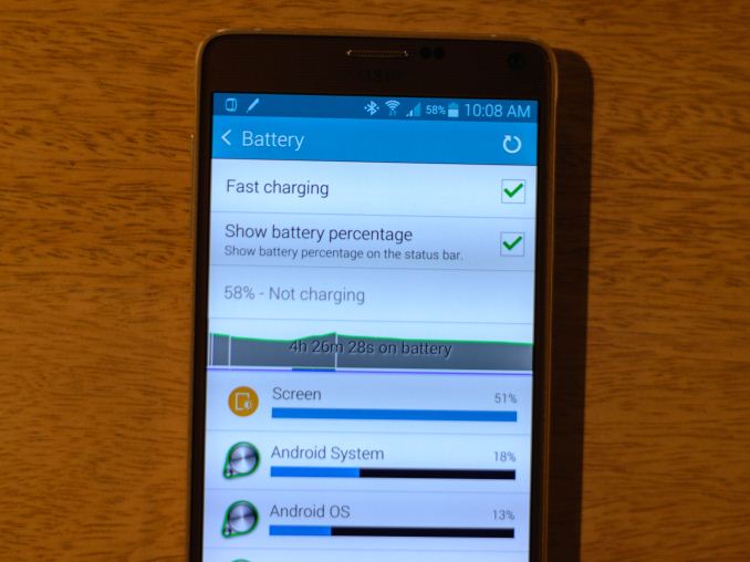
A noticeable spec omission was the lack of water resistance, which was implemented quite successfully on the Galaxy S5 line. The only other notable regression was a move back to the microUSB 2.0 connector, but it’s likely that this was done out of practicality as the microUSB 3.0 connector is quite cumbersome to use. This doesn't result in worse charging capabilities though, as Samsung advertised that their charger would charge the Note 4's battery to 50% in half an hour compared to the hour that it would take the Note 3. Interestingly enough there is a toggle to enable or disable this feature, presumably for heat and battery longevity concerns.
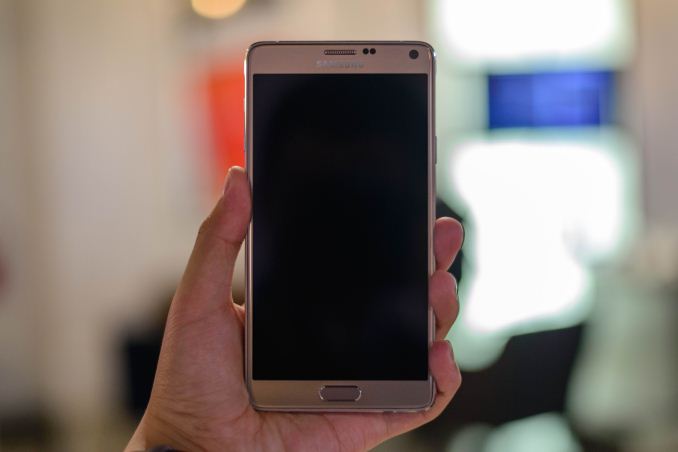
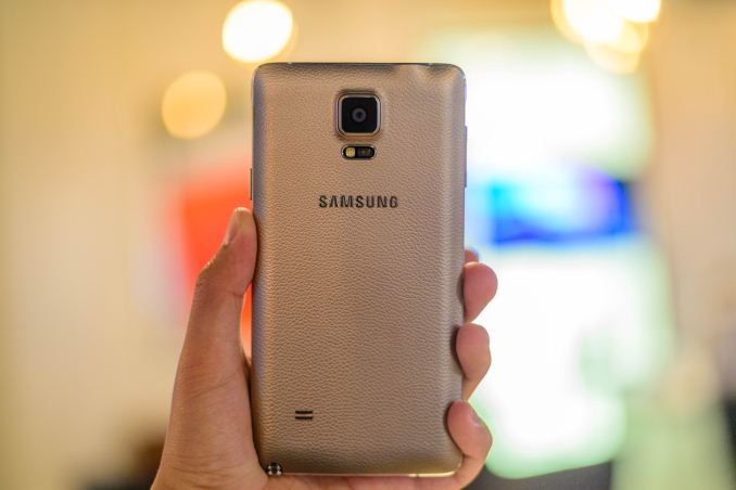
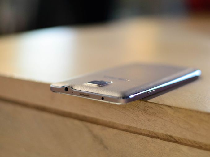
Of course, there’s a lot more to the Galaxy Note 4 than just specs, and one of the major areas where Samsung has iterated for this generation is the design. Much like the Galaxy Alpha, we see a metal frame with chamfered edges running around the side of the phone. As previously discussed in our article on material choices and in Samsung’s official blog, this move helps to improve drop resistance due to the increased rigidity of the metal frame. This move also greatly improves in-hand feel as it’s no longer glossy plastic, which also helps to improve the overall look. In addition to the new metal ring, the back cover is noticeably different from the Note 3. While still soft-touch for the black model, the stitching pattern has been removed and the back cover now molds closely to the metal sides instead of noticeably protruding. Finally, there’s a noticeable change to the button feel for this generation, with much less slack in the power and volume buttons, and the actuation both feels and sounds much more clean and crisp. The home button is also noticeably larger than what we saw on the Galaxy S5, and it seems that this may be due to an improved fingerprint sensor.
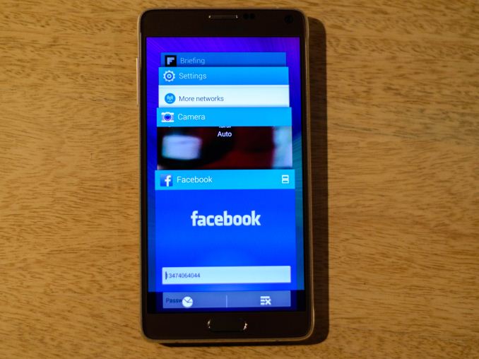
However, there’s more to the Note 4 than just hardware changes. Samsung is also emphasizing new software features. While Samsung is emphasized a more mouse-like experience for S-Pen in the form of easy drag and drop/highlight modes by pressing the stylus button, I found that the improved Multi Window system is really the most noteworthy change. First, the need to long press the back button to bring up the menu is effectively deprecated. Instead, Multi Window is now integrated into the Android L-esque multitasking menu. If an application supports Multi Window, an icon will appear on the top right of the app’s card in the multitasking menu, and tapping it will automatically open it as a second window.
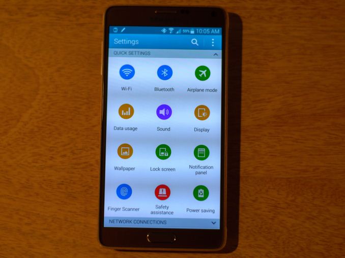
In addition, dragging a window from the corner will automatically turn the application into a floating window if it’s supported. There are no real changes to the appearance of TouchWiz UX, although some aspects have been altered. For example, the settings menus have replaced black backgrounds with white ones. It’s likely that this was done to prevent purple smearing effects that come from transitions to a lit pixel from a fully black one.
To recap, the Note 4 has the latest and greatest SoC and RF. The camera is better for low light with its hardware optical image stabilization. The industrial design is noticeably more restrained and tasteful compared to past designs. The material design is noticeably better for in-hand feel and protecting the phone, and if the GS5 LTE-A was any indication the display of the Note 4 should be head and shoulders above the Note 3. The software continues to be the best I’ve seen in the phablet space in terms of functionality. Overall, if you have bought into the concept of a phablet, the Note 4 should continue Samsung’s lead in this space. Of course, this is merely based upon first impressions. It will take a full review to make a final judgment on the Galaxy Note 4.
The Note 4 will be available in Charcoal Black, Frost White, Bronze Gold, and Blossom Pink in global markets starting in October. In the US, it will be available on AT&T, T-Mobile, Verizon, Sprint, and US Cellular.




69 Comments
View All Comments
Drumsticks - Wednesday, September 3, 2014 - link
This is the first shipping phone with the S805 right? It'll be interesting to see the performance. There must be some pretty nice power improvements from either there or some software magic to get a 7% increase (according to Samsung) in battery life with an extra 20mah on that 1440p screen.Looks more impressive than I imagined, but I'm not sold on phablets still. Looking forward to the review from y'all!
JoshHo - Wednesday, September 3, 2014 - link
Internationally it should be the first but there are a few Korean phones shipping with this SoC.We tested one here:http://www.anandtech.com/show/8314/galaxy-s5-ltea-...
Drumsticks - Wednesday, September 3, 2014 - link
Oh that's right, thanks. Based on google (I didn't see it in your test I think) that was a 2.5Ghz part, so it's possible performance could go up another 5-10% with this.Interesting all around, at least. Thanks!
kron123456789 - Thursday, September 4, 2014 - link
Et tu, Nvidia?http://blogs.nvidia.com/blog/2014/09/04/nvidia-lau...
senEdCraft - Friday, September 26, 2014 - link
The Galaxy note series is absolutely fantastic, we all know that. But it doesn't quite manage to reach the level of HTC One M8 (see for example: http://www.consumertop.com/best-phone-guide/ ).kron123456789 - Wednesday, September 3, 2014 - link
There won't be much performance increase compared to Note 3 because of 1440p display.bigstrudel - Wednesday, September 3, 2014 - link
Exactly. Resolution is the enemy of performance.maroon1 - Wednesday, September 3, 2014 - link
That if you assume that games run on native resolution. But many android games don't anywaytuxRoller - Wednesday, September 3, 2014 - link
That's not necessarily true.Apparently the new adreno arch includes fbc (not yet enabled in drivers, apparently).
uwleahcim - Wednesday, September 3, 2014 - link
Be sure to completely test our the new S-Pen.Samsung claims the new S-Pen supports Tilt and Rotation! These features were only found in highest end Wacom devices!
The addition of Tilt and Rotation is as significant as the pairing of a 3-axis gyroscope to 3-axis accelerometer! With Tilt and Rotation, it is now possible to fully simulate a pen/brush experience on a digital screen.
I was really hoping MS would introduce Tilt and Rotation to the Surface 3, but I'm guessing Wacom doesn't want the Surface to eat into their ultra expensive Cintiq line. This is probably why Wacom allowed the Note 3 to have tilt and rotation since a 5.5" will never compete against the much larger Cintiqs.